
I reviewed the Vofy homepage today and noticed it is still trying to speak to too many people at once.
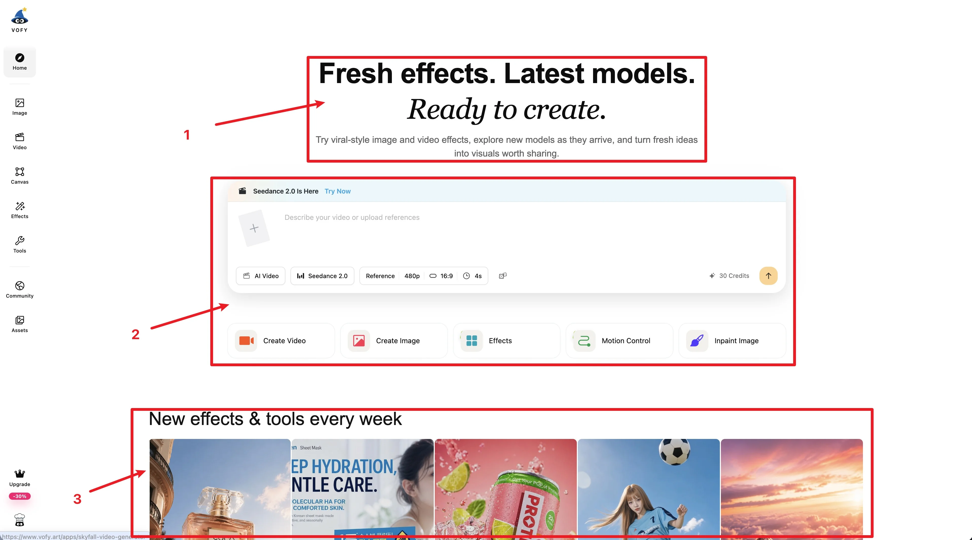
- The headline is too broad. It says "Fresh effects. Latest models. Ready to create." It is accurate, but it could describe too many different products: an AI model hub, a viral effects site, an AI app directory, a creator community, a lightweight creative workspace, or a marketing asset tool. Those are not just different ways to describe the same thing. They are built for different people.
-
The creation box is trying to serve both advanced and casual users. Model, reference, resolution, aspect ratio, duration, credits, and multiple modes can be useful for advanced AI creators, but too much for casual users.
-
The templates are mixed for different people. Beauty effects, ecommerce creatives, product shots, general AI effects, and experiments can all be useful, but not for the same person. A beauty user, an ecommerce seller, and an AI creator should not see the same homepage.
So the next question for Vofy is not what to add next. It is who the product should feel simple for. Once that is clear, it becomes easier to decide what to hide, what to show first, and which templates belong on the homepage.