
The biggest design problem of Vofy is not one specific component. It is that the page is still moving between two different jobs: landing page and dashboard.
The page has dashboard elements: a sidebar, app shortcuts, tool entries, and creation actions. But it also has landing page elements: a large headline, value proposition, feature sections, and Q&A.
Those two surfaces have different purposes.
If this is a landing page, the user may not know what Vofy is yet. The page needs to explain the product, build trust, and help the user understand why they should try it.
If this is a dashboard, the user already has some intent. They want to create, compare tools, find recent work, and move faster. The page should give them useful information and clear actions, not spend most of the first screen explaining the product.
So if Vofy wants this page to work more like a dashboard, a few design problems become much clearer.
-
Related areas are not visually grouped enough. The sidebar should feel clearly separate from the main content. It could use a different background or stronger boundary so users immediately understand that it is navigation. Inside the main content, different sections also need clearer grouping. Right now the blocks are present, but the boundaries are too soft.
-
The useful density is too low for a dashboard. The headline takes a lot of space, and the two sides of the page leave too much empty room. A dashboard can still be clean, but it should use the first screen to help users act faster. If the goal is efficiency, the page needs more useful density after the structure is clear.
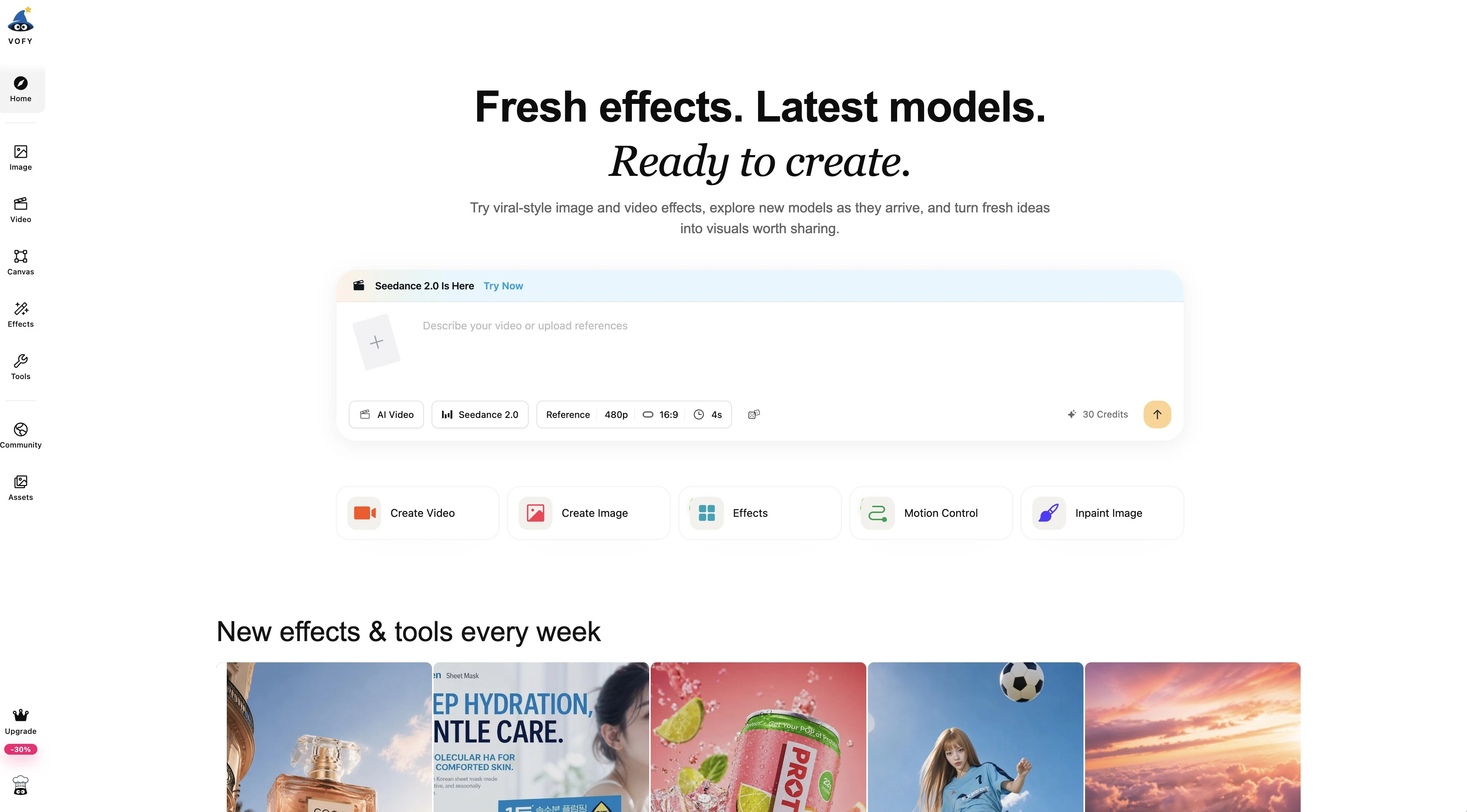
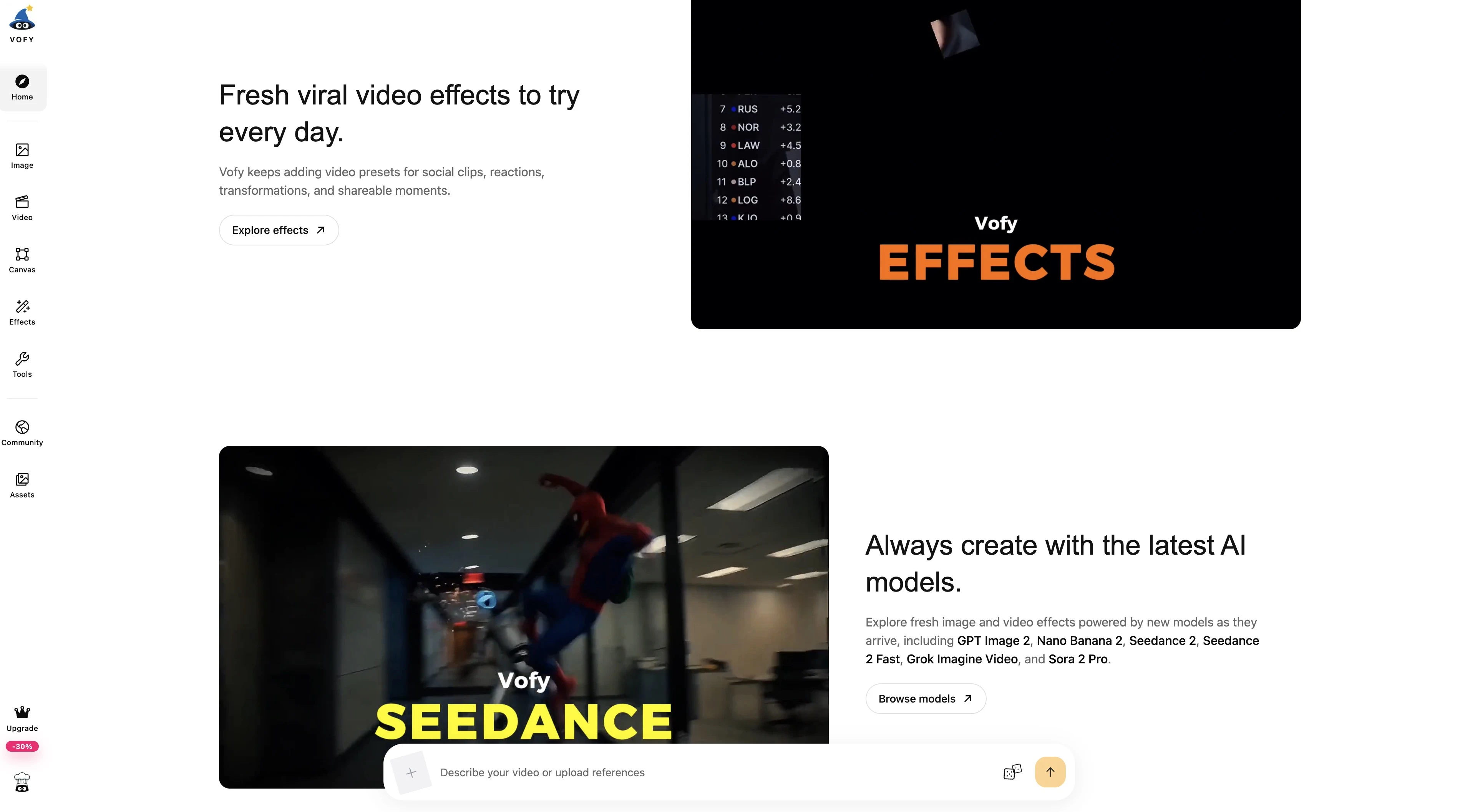
- The lower page keeps switching back to landing-page content. Sections like "Fresh viral video effects" and "Always create with the latest AI models" are explaining the product, while the creation input is still present as a dashboard action. The page is asking the user to both learn and create at the same time.
-
The color system does not feel clear yet. Vofy does not have a strong theme color on this page. The interface uses blue, orange, pink, green, purple, black, and soft gradients, but they do not feel like one system. The colors make the page feel busy without helping users understand what is primary.
-
The visual contrast is too flat. Much of the page is white and blue, and many elements have a similar visual weight. It is hard to tell what matters most at a glance. In a dashboard, users should be able to scan the page and quickly understand the primary action, the secondary options, and the supporting content.
-
Some responsive and dark mode details are not clear enough. In dark mode, several elements do not have enough separation. On mobile, some text becomes hard to read because of the available width. These are smaller details than the landing page versus dashboard problem, but they matter because they make the interface feel less stable.
The next question is not only how to make the page prettier. It is what job this first screen should do.
If it is a landing page, it should explain Vofy more clearly. If it is a dashboard, it should help users create faster. Mixing both makes the page harder to understand.